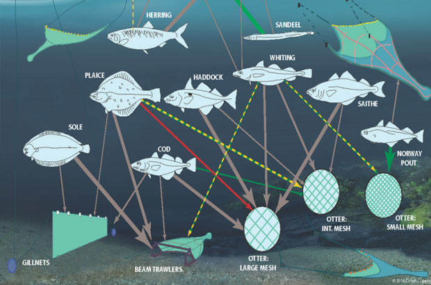
My role is to identify, understand and bring together all research that is going on in the UK (and often beyond) about climate change and how it impacts upon the marine environment; and then communicate these findings to decision-makers, policy advisors and the public.
Although the internet is a wonderful source of information, many of the same stories are remoulded for different audiences, which is great, but more often than not in a text format.
My passion is to communicate the same message and complex information in an image. There is an international movement towards visualising data in this way, particular where there is a need to communicate science for policy purposes. If you have not heard about data visualisation, also known as “infographics”, you should read the book “Information is Beautiful” by David McCandless. It contains pages of amazing infographics from all scientific fields. These infographics are easy to understand even without knowledge about their subject areas.
Recently, several of my colleagues at Cefas and I attended a Data Visualisation workshop run by Guardian Digital Agency and I wanted to share some tips to help others who are interested in communicating science in a different way.
Tip 1: Understand if you want to include all data points or provide a summary message. These two approaches are very different and these websites by leaders in the field may provide you with ideas: Edward Tufte and David McCandless.
Tip 2: Think about the subconscious message of every element of your graphic. Everything about design has a meaning: the font you use, the colour you pick and layout style, e.g. red can mean love, danger, heat. So plan ahead and think carefully about what you want the image to say.
Tip 3: There are several websites that can help you create your infographics. Try typing some key words into a search engine, such as: “free infographics”, “tools data visualisation” or “icon archive”.
Tip 4: Infographics can be interactive. If they are, they should be intuitive and rewarding.
Tip 5: Any statistics can be made interesting, if they are presented in the right way. This TED talk by Hans Rosling is an example of how to make your statistics come alive.
If you would like to see some of my work, then my fully citable figures can be viewed on my figshare account; and, if you are interested in organising a similar event, please contact @adamfrostuk @skelington or contact the Norfolk Network Research Communications Group to discover more.
This blog post was originally for NNRCG and was amended for the Marine Science Blog. http://nnrcgblog.blogspot.co.uk/2014/04/design-gives-you-permission-to-speak.html
You can follow us on twitter @CefasGovUK.
1 comment
Comment by MollyFuhrmann posted on
Hi! I've been following your blog for a while now and finally got the courage to go ahead and give you a shout out from Humble Tx! Just wanted to say keep up the fantastic work!